Portfolio - Our Works
-
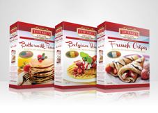
THIERRY'S RECIPE
For this design, we chose to make the 'Thierry's Recipe' logo simple, yet bold and matched it with the dark red used as the packaging's signature colour [...]
View Project -
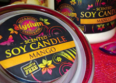
ELYSIUM FACE & BODY
Rather than using traditional pastel colourings, as commonly seen in this industry, we proposed the idea of using bold pinks and oranges [...]
View Project -
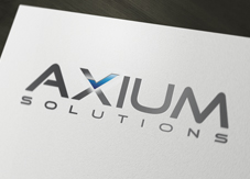
AXIUM SOLUTIONS
In creating this logo, we looked at simple ways to accentuate the letter 'X' in 'AXIUM', as requested by the client. To affirm the company's strength [...]
View Project -
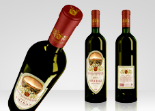
DAVID LAWRENCE FINE WINES
To make this wine label appear elegant and 'aged', a textured background with soft colourings was chosen. The label has been designed to be die-cut [...]
View Project -
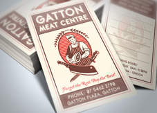
GATTON MEAT CENTRE
In keeping with the 'traditional' theme of the client's logo, we chose to create a vertical business card layout with a clean, retro feel [...]
View Project -
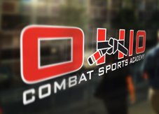
OHIO SPORTS COMBAT ACADEMY
Inspiration for this logo came from the Brazilian Jiu-Jitsu Black and Red Belt - one of the highest belts attainable within the sport [...]
View Project -
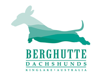
BERGHUTTE DACHSHUNDS
In creating the logo and advertisement for Berghutte Dachshunds, we took inspiration from the client's location of Kinglake, Victoria [...]
View Project -
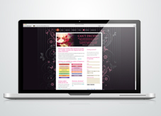
ELYSIUM FACE & BODY WEBSITE
This client requested a fun and funky, yet elegant, website design to reflect her personality. We proposed a faintly striped black background with [...]
View Project -

PACKAGING
At Wick'd Design Concepts, we love packaging design projects! From small and simple boxes, to complex shapes and large product display units [...]
View Project -
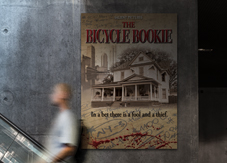
SALIENT PICTURES
The designs for both of these movie posters focused on obscured imagery hinting to events in each movie without giving away the synopses [...]
View Project -
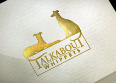
TALKABOUT WHIPPETS
Talkabout Whippets required an elegant, yet bold approach. Silhouettes of two Whippets sitting on a ledge, with their tails draping down, form [...]
View Project -
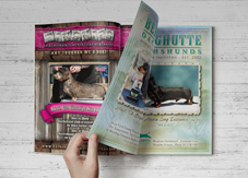
ADVERTISING
With years of experience in the printing industry, including pre-press, we specialising in print-ready advertising for any magazine or newspaper [...]
View Project

